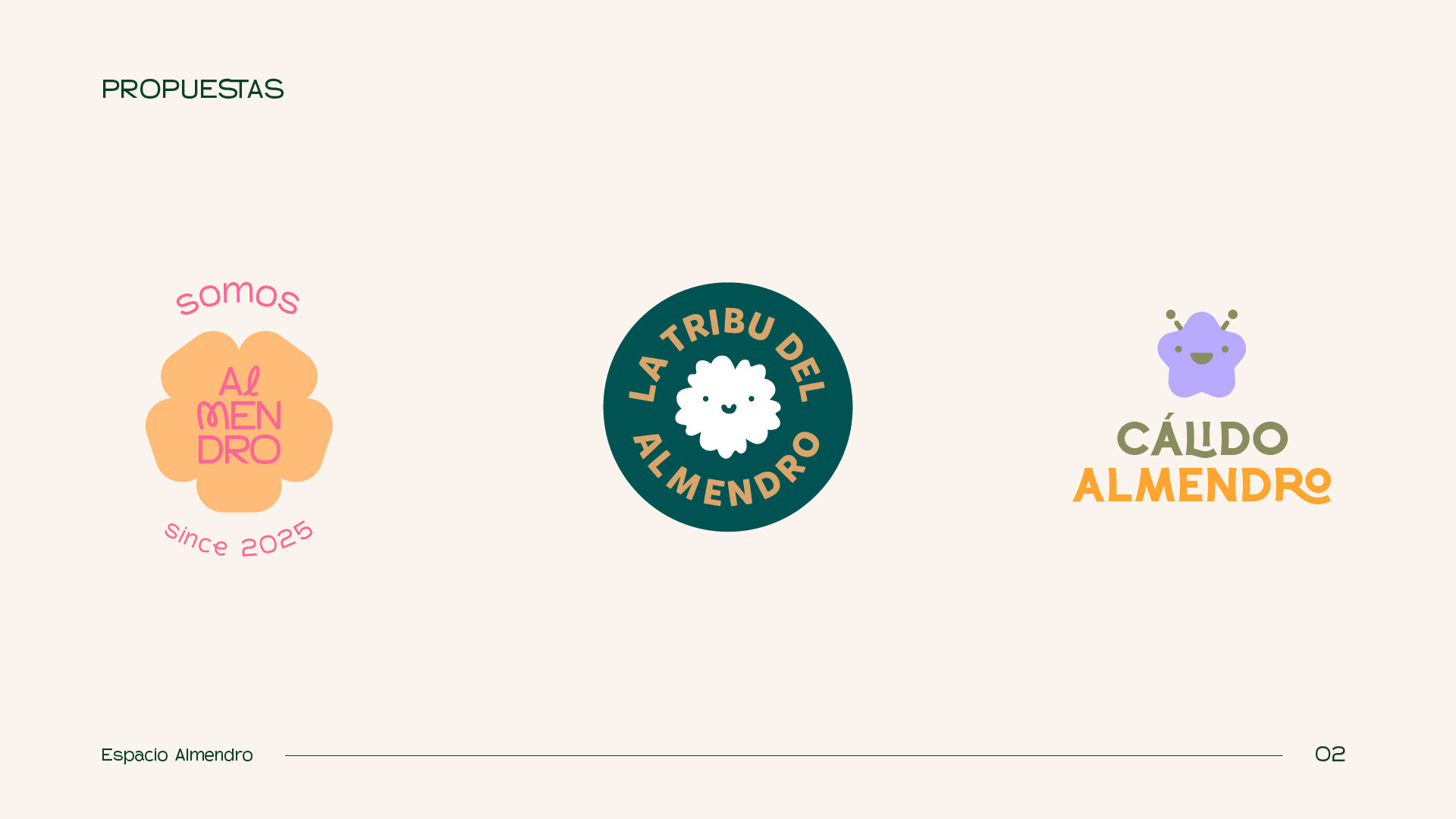
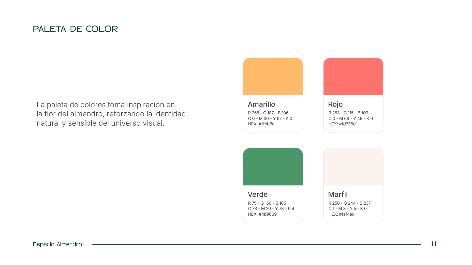
I worked on different proposals based on ideas and concepts such as: connection, tribe, warmth, closeness, playfulness, and friendliness.
Following this approach, I developed various taglines and descriptors to reinforce these concepts and strengthen the brand identity.
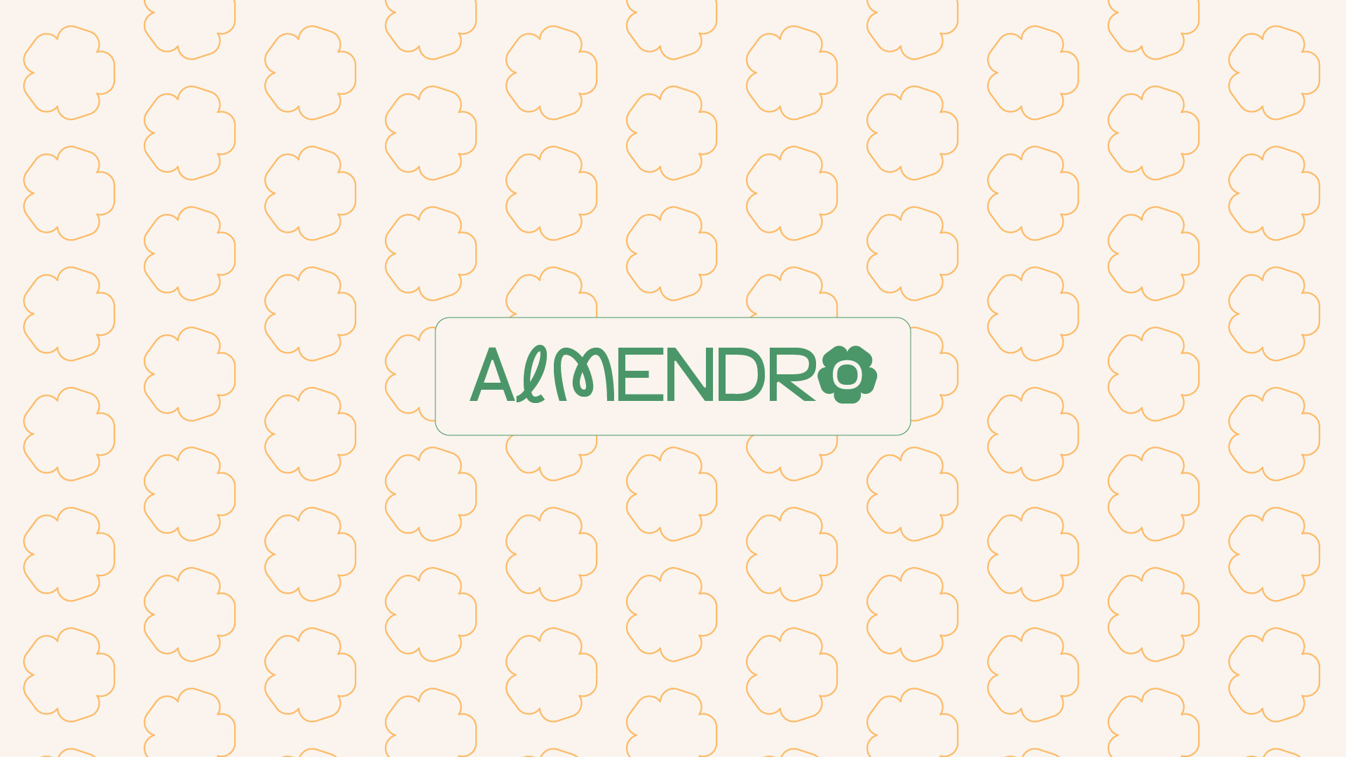
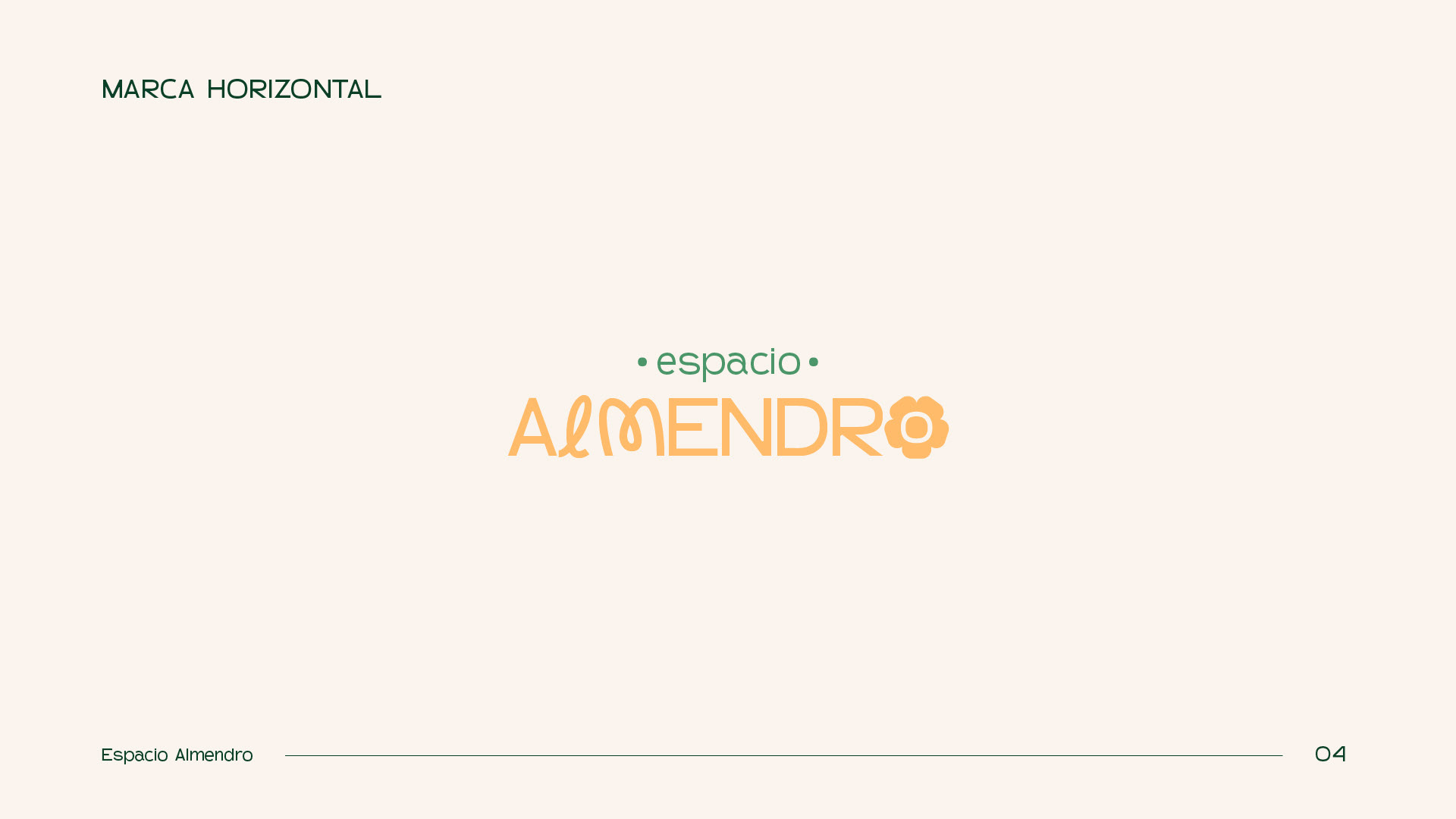
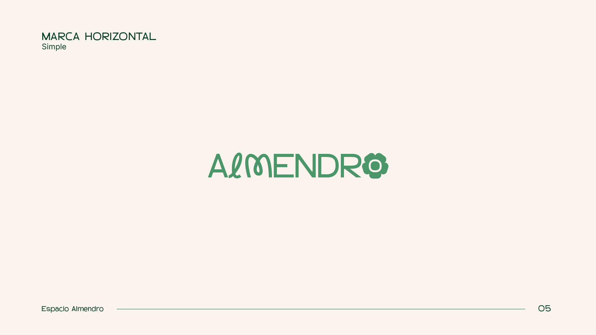
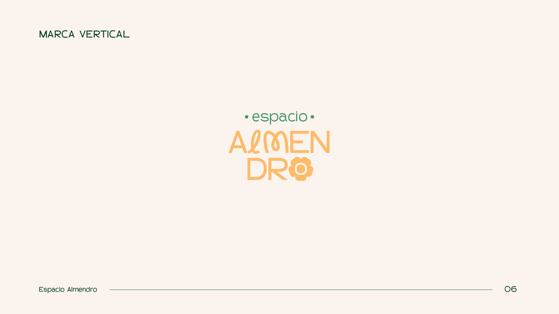
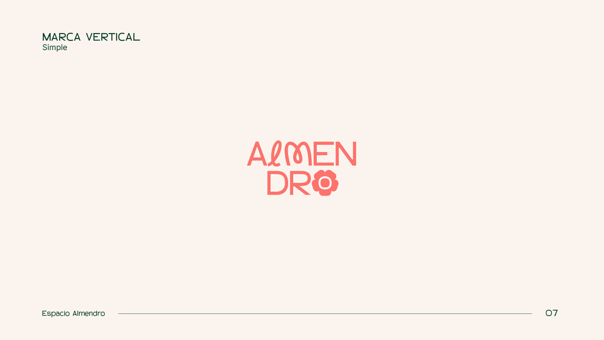
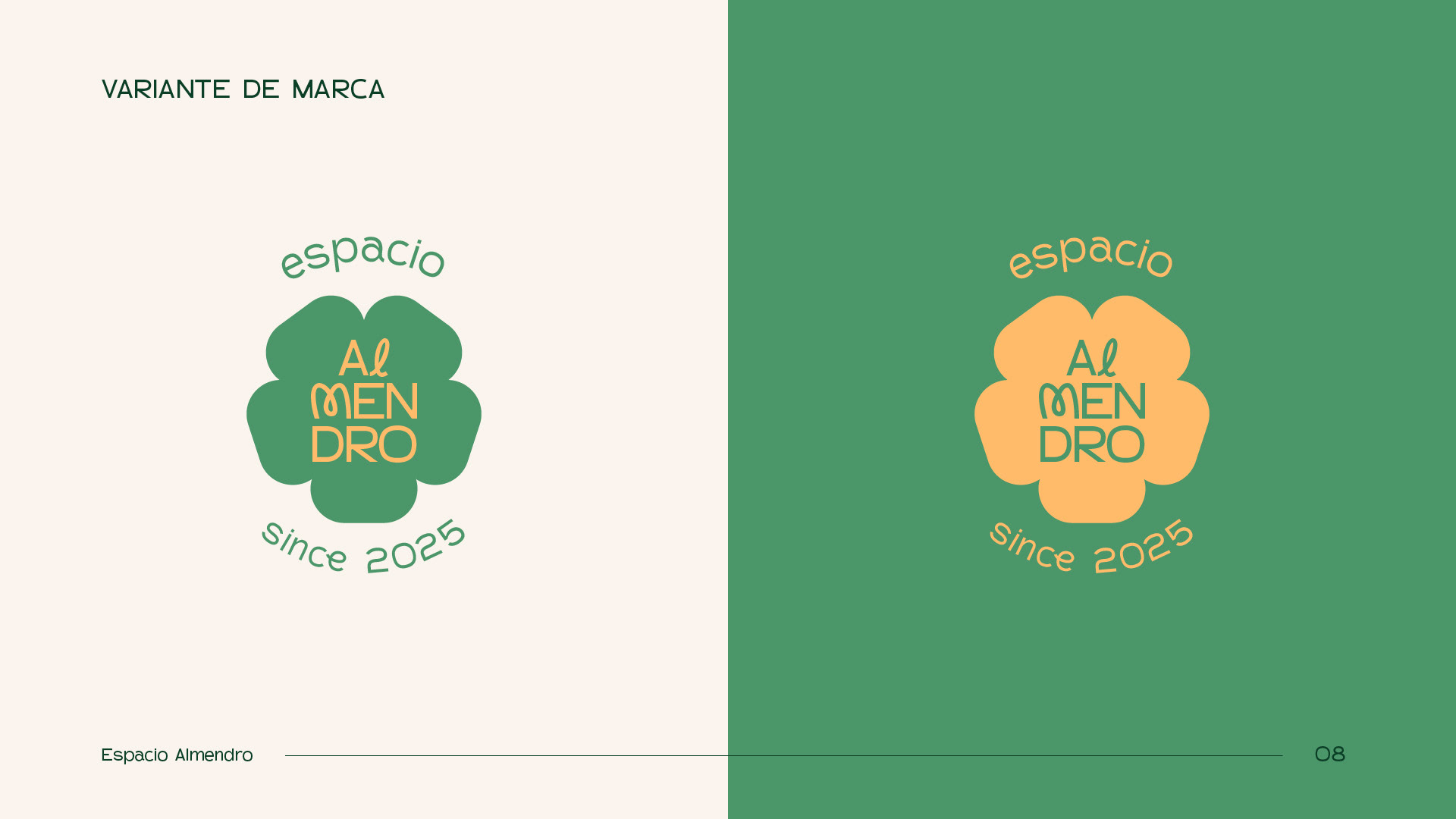
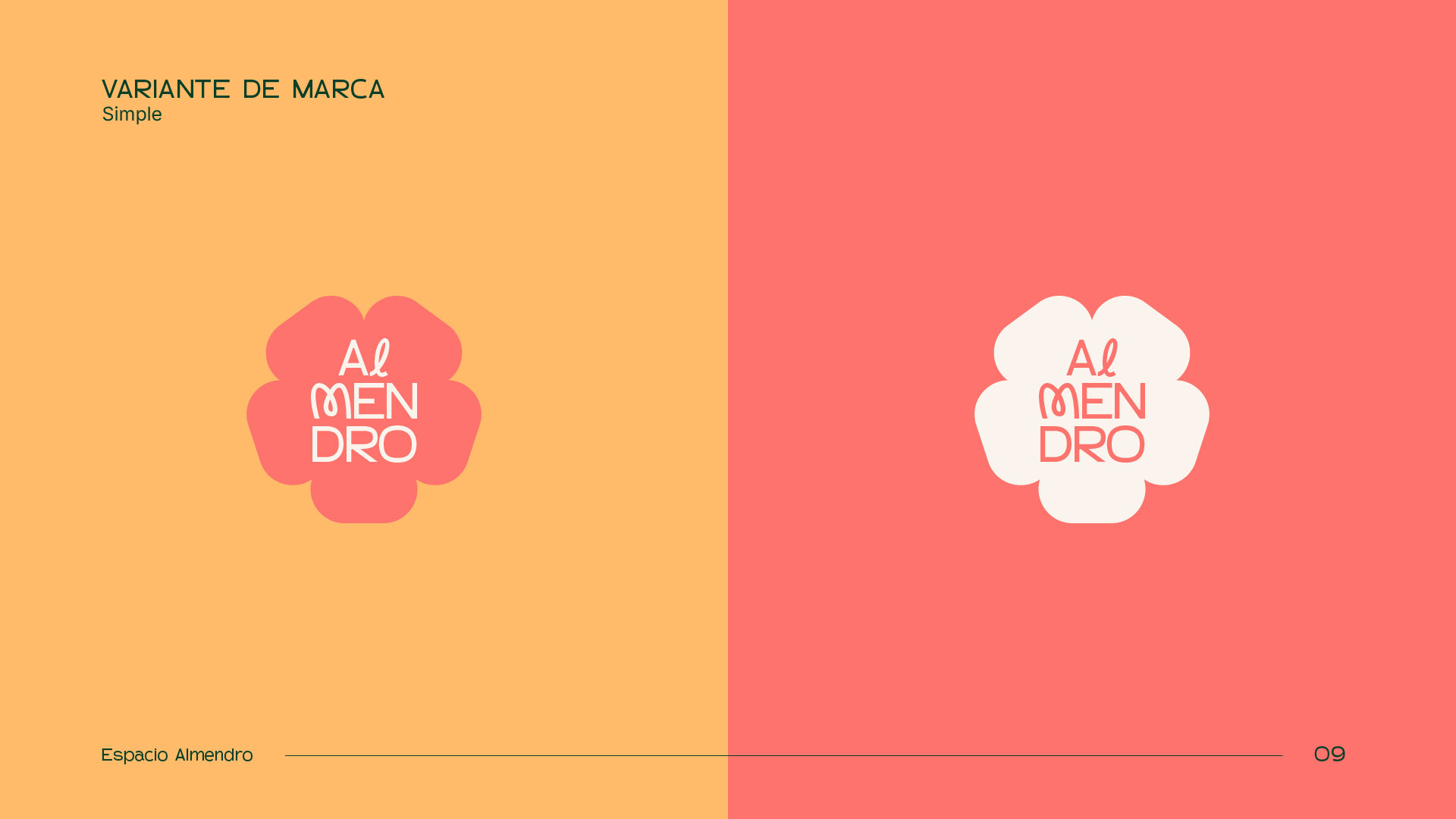
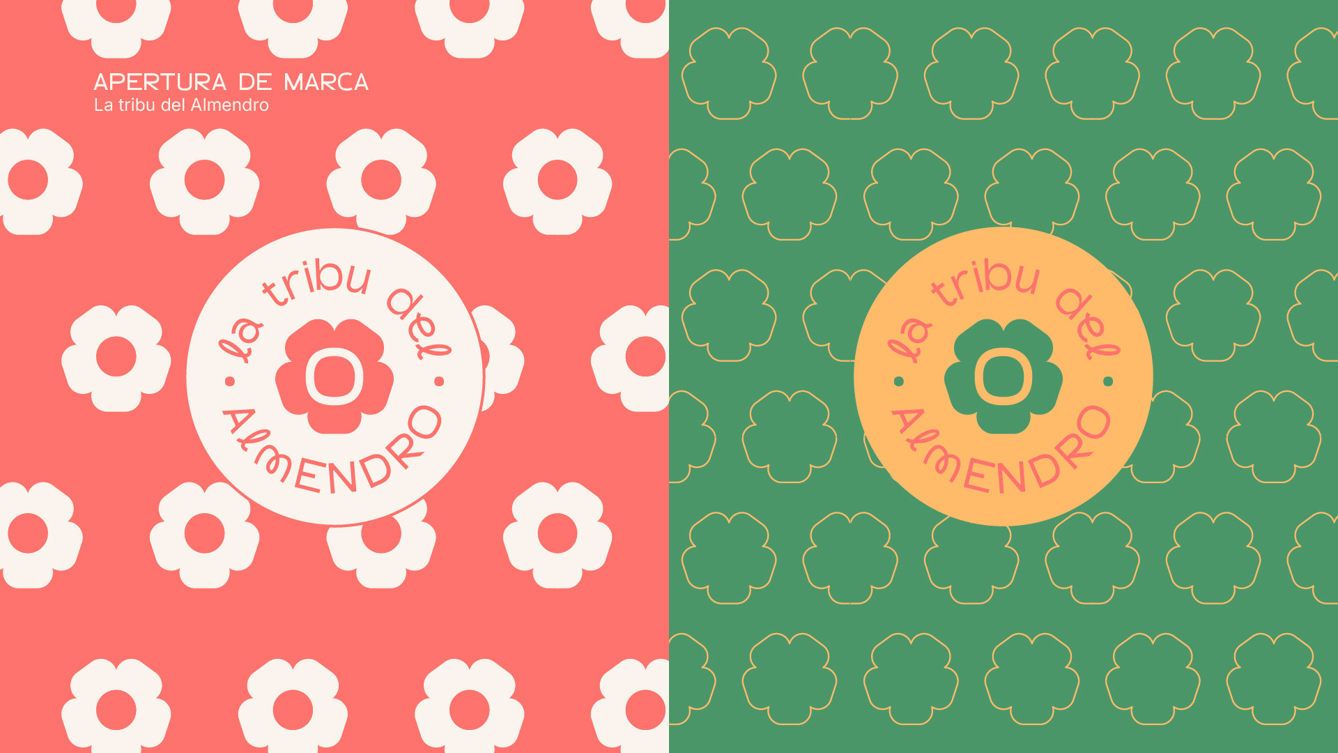
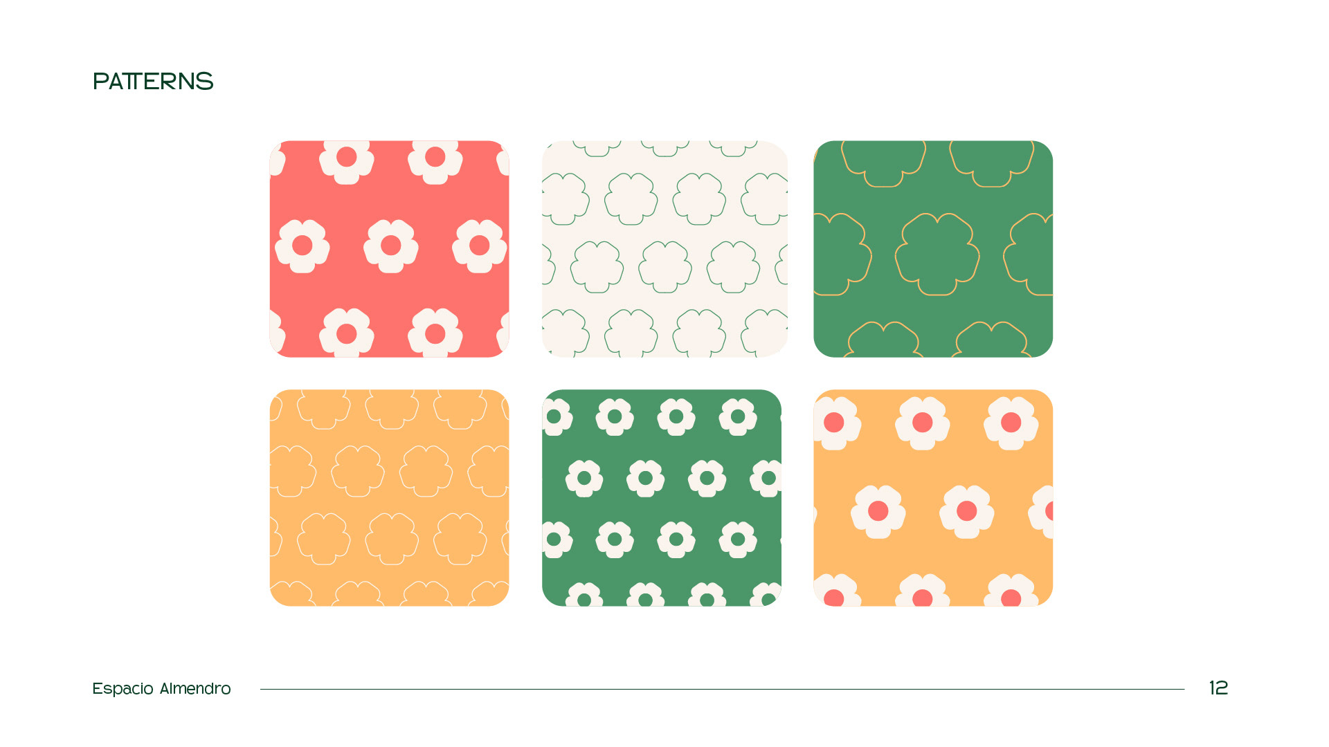
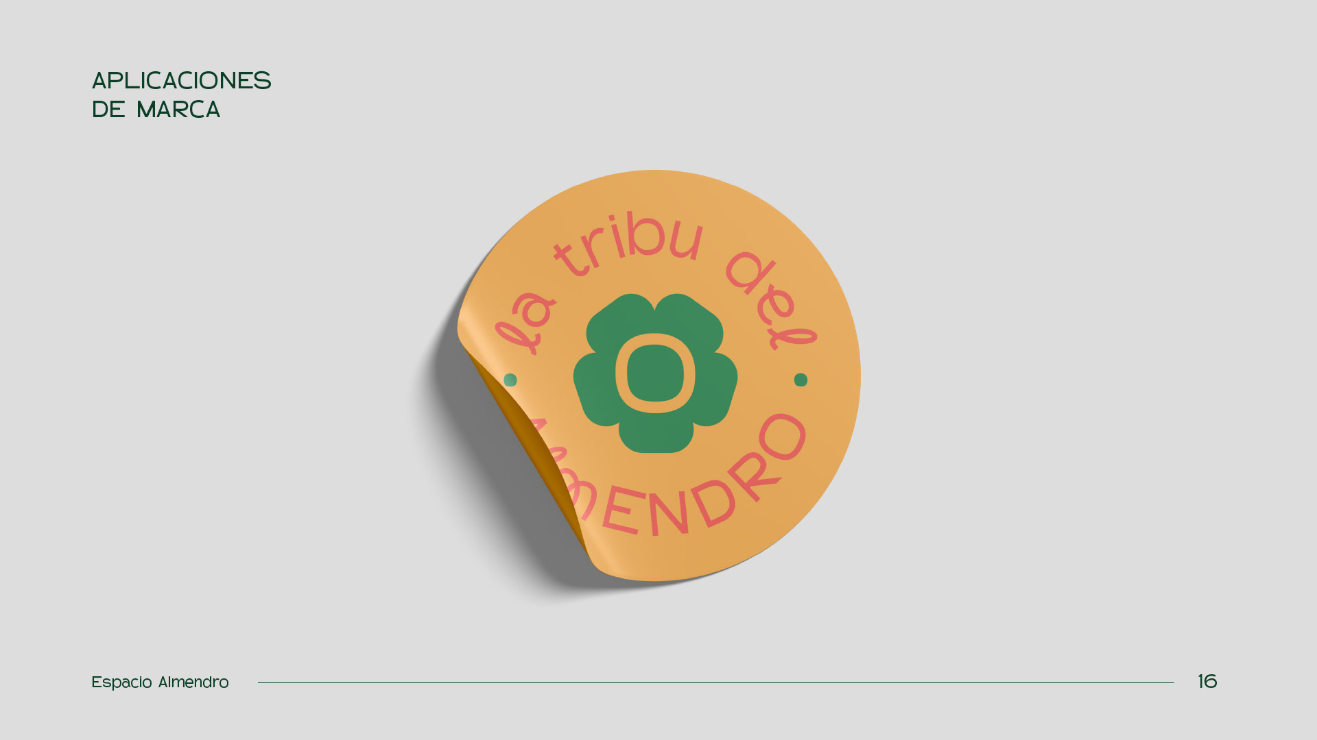
The flower became the main visual element for the logo.
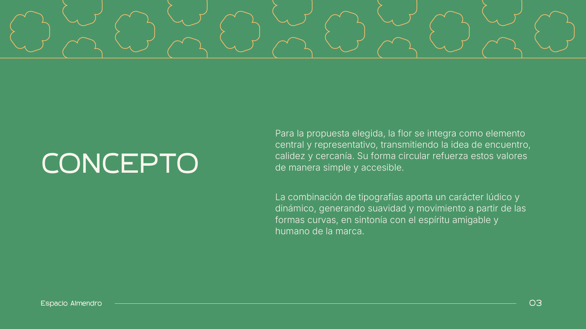
For the chosen proposal, the flower is the central and representative element, conveying connection, warmth, and closeness. Its circular shape reinforces these values in a simple, approachable way.
The combination of typefaces adds a playful, dynamic character, creating softness and movement through curved shapes, reflecting the brand’s friendly, human spirit.
Developed for OTW